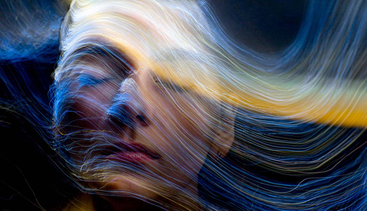
We live in a universe of colors. Wherever you set your eyes, you see various hues and color combinations all around you. Like fish in the ocean, we are not readily aware of the colorful waters surrounding us. Most importantly, we pay little attention to how they affect us. Color psychology uncovers the psychological impact of different colors, forming the basis of color selection in design.
What Is Color?

Color is a sensory illusion. Light contains wavelengths across the visible light spectrum. When it hits a surface, certain wavelengths are absorbed while others are reflected. The reflected wavelengths of light determine the colors we see. The red rose, for instance, absorbs all the wavelengths of light except red, which is then reflected. Red is not a physical property of the rose but of light. All objects around us display their particular colors based on how much they absorb light. White surfaces reflect all wavelengths of light whereas black surfaces absorb all wavelengths of the visible light spectrum.

The way your brain processes the interaction of light and objects plays a defining role in color perception. There is a layer of light-detecting cells at the back of your eyeballs called the retina. Among these photoreceptor cells are cones, which are divided into three kinds depending on the specific wavelengths of light they process – red, green, and blue (RGB). If our brains can only process red, green, and blue, how come we see different colors too?
The answer is the visual cortex. The visual cortex is the area of your brain responsible for processing visual data and constructing visual perception. If an object reflects yellow wavelengths, the green and red cones of your retina will send signals to the visual cortex, which will then interpret the combination of green and red as yellow. Whatever wavelengths of light an object may reflect, they are always filtered through the RGB cones in your retina and interpreted in the visual cortex, where color perception takes place.
Color Psychology

Color psychology is the field that studies the psychological impact of colors. The idea that colors impact emotions dates back thousands of years. The Ancient Egyptians believed that colors embodied specific qualities that could affect us upon exposure. In the Ebes Papyrus, certain colors were prescribed as medical treatments addressing various ailments. In their temples and artifacts, color selection was based on the qualities of color rather than aesthetics.
Thousands of years later, Johann Wolfgang von Goethe explored how colors impact our moods and emotions in his Theory of Colours (1810). He proposed a holistic understanding of perception that accounted for the subjective, psychological, experience of color. In the 20th century, Carl Jung explored color as a language of the unconscious in the context of archetypes, dreams, and personality types. His contributions significantly influenced the development of modern color psychology.
How Colors Influence Emotions

Colors influence our emotions in several ways. The impact is typically subliminal and automatic, which is why we are often not consciously and readily aware of the influence. Researchers have proposed several theories to explain how this influence takes place. On the one hand, our personal or cultural color associations can mediate our emotional responses to colors. On the other hand, certain colors can evoke certain emotional responses regardless of contextual associations.
For example, red physiologically increases our heart rate and attention levels because it is a long-wavelength color. Consequently, red is a color that stimulates us emotionally. Alternatively, some researchers explain the impact of certain colors from an evolutionary perspective. For example, we may be drawn to colors such as blue and green because they are connected to what our ancestors would’ve considered an ideal natural habitat with water and plants. Whatever the explanation, there is little debate that colors influence our emotions to a great extent.
Color Psychology in Design

Color psychology matters in design because it influences our emotional states and decision-making. In interior design, for example, colors are chosen based on the function of the space. For instance, colors with a calming and soothing emotional impact, such as beige, are typically used in spaces designated for rest, such as bedrooms and spas. Color saturation is also a factor to consider – the more saturated a color, the more emotionally stimulating it is. Saturated red, for instance, can be great for gyms but counterintuitive for meditation rooms.
Color is also crucial in branding as a marketing tool. For example, incorporating navy blue in a logo design evokes emotions of confidence and trust, making a product seem more dependable. The colors used in logo designs are not random, but instrumental in influencing your decision-making. Additionally, colors in fashion can evoke certain emotional responses that determine first impressions. For example, studies have shown that wearing vivid colors, instead of neutral ones like black and beige, makes people seem more approachable.
The hidden power of colors on our emotions and decisions makes them indispensable tools in all fields of design for reasons that far surpass their aesthetic appeal.