Edward Hopper was many things. He was a starving artist during the 1910s, struggling to carve out a living while developing a painting style that would eventually be praised for its emphasis on commonplace subjects. He was a successful artist during the 1920s and 1930s, perfecting his style while producing works that rank among the most recognizable and influential of the 20th century. Both of these phases have been thoroughly explored through memoirs and historical texts, but less discussed is Hopper’s third (and admittedly more common) vocation: movie fan.
Edward Hopper’s Affinity for Cinema

Hopper may have spent his days studying the works of great European painters like Rembrandt and Goya, but his evenings were often spent in theaters, observing the unique dynamic between movies and moviegoers. In a 2004 retrospective for The Guardian, author Philip French claimed that Hopper would go to the movies for a week straight if he was struggling to make progress on one of his paintings.
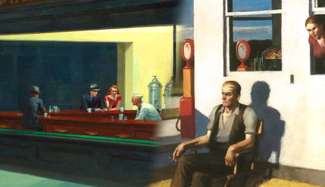
Moviegoers would go on to inspire some of the artist’s most acclaimed works, including The Balcony (1928) and New York Movie (1939), but the movies themselves influenced his use of shadows and framing. It was, fittingly, Hopper’s mastery of these cinematic elements that ultimately made him a popular reference point for directors and cinematographers. Hopper may have loved the movies, but the movies loved him even more. The most logical starting point for a conversation about Hopper and movies is Nighthawks (1942). Hopper’s most famous painting was inspired by the Ernest Hemingway short story The Killers (1928), and its evocation of urban emptiness was so profound that when it came time to adapt the short story into a movie, Hopper’s painting was used as the visual template.
Nighthawks and the Development of Film Noir

In both Nighthawks and The Killers (1946), diner patrons congregate at an hour in which most people are seemingly asleep. There is additional context provided for the latter, of course, but it is telling that the film’s most striking moments are the ones directly indebted to Hopper. The Killers helped to establish the post-World War II phenomenon known as film noir, and Hopper’s influence was etched into its DNA.
Force of Evil and The Naked City (both from 1948) went beyond emulation and attempted to create Hopper-esque imagery that was unique to their stories. Abraham Polonsky, the writer and director of the former, was an enormous admirer of Hopper, and he took his cinematographer to Hopper’s exhibition to ensure that they were on the same page. Force of Evil was the first film to capture the look and feel of Hopper’s Third Avenue paintings, which is to say, it presents New York City as a beautiful, expansive, and ultimately indifferent landscape.
Hopper, Hitchcock, and Gothic America

The movie’s climactic sequence, in which the lead character looks for a body near the Hudson River, is depicted from afar, emphasizing the unimportance of the character’s desperation amidst the city’s skyline. It brings to mind Hopper’s Manhattan Bridge (1925-26), which also uses perspective and emphasis to make a grand statement about isolation. Hopper’s paintings were helping filmmakers develop a more sophisticated eye, but there were intricacies and elements to the artist’s style that were still beyond the capabilities of Hollywood productions.
It wasn’t until the release of Psycho (1960) that Hopper’s style was fully realized on screen. The movie details a string of murders that take place at the Bates Motel, which is located in the middle of nowhere, and the mystery surrounding the Bates Mansion, which is a dead ringer for Hopper’s House By the Railroad (1925). Alfred Hitchcock had flirted with Hopper-esque flourishes in his previous movies, but the director saw an opportunity to tell a story about isolation and entrapment that was emblematic of American culture on a grand scale. He felt that Hopper’s distinctly gothic viewpoint was the perfect lens through which to frame it.
Room In Brooklyn and Urban Isolation

Psycho is one of the most iconic movies of all time, and a great deal of its iconography stems from Hopper’s influence. The very first shot is an homage to Hopper’s The City (1927), and the claustrophobic interior of the Bates Motel, from which the titular character is often shown, is pulled directly from Room In Brooklyn (1932). Hitchcock and screenwriter Joseph Stefano went as far as to model the film’s performances after Hopper’s lonely subjects. “I told [Anthony Perkins] that I felt that Norman Bates, if he were a painting, would be painted by Hopper, and he agreed,” Stefano recalled during an interview with The Austin Chronicle.
Hopper discussed his approach during a 1959 appearance on the series Invitation to Art. He spoke of the importance of letting an idea gestate, rather than rushing to get it out (hence, lots of nights at the theater), but perhaps even more telling is what he said about the interpretation of his paintings. In his estimation, the focus of a given piece of work was something that manifested throughout its making. “The important element in a picture cannot be defined,” he asserted. “[It] cannot be explained…”
Hopper’s Influence on the New Hollywood

Hitchcock, a storyboard artist in his youth, understood the distinction. He knew how to set up a frame and gradually draw the viewer’s eye. Psycho is perhaps the greatest cinematic distillation of this painterly approach. Edward Hopper died in 1967, and the movies that were subsequently influenced by his works took on a wistful quality. The aspects of the artist that had been so appealing to the noir and horror genres had receded, and the directors who comprised the New Hollywood generation were more drawn to the ways in which he depicted societal change.
House By the Railroad is again used as a reference point in Days of Heaven (1978), but instead of denoting American wickedness, the structure is used to symbolize the emptiness of the American Dream. Days of Heaven details a love triangle between a farmer, his girlfriend, and the owner of the farm. Terrence Malick, the director, is famous for his reliance on imagery over dialogue, and as such, the movie has elongated stretches that feel like Hopper paintings come to life. It’s not just the lighting and period attire that prompt this sensation, but Malick’s use of negative space.
South Carolina Morning and the Use of Negative Space

The characters either fail to connect with others or withhold their emotions for fear of connection, and the emptiness in the frame keeps the viewer at a permanent distance. We are ultimately forced to project our experiences onto them, as we do with the subject of Hopper’s South Carolina Morning (1955). South Carolina Morning is emblematic of another Hopper hallmark: insulation. The men and women in his paintings are pining for something more than the angular, ordered settings in which they appear, and yet they are stuck.
Blade Runner (1982) and Paris, Texas (1984) are radically different movies on the surface, with the former being a detective story set in the future and the latter being a study of grief in the present, but both utilize Hopper’s visual tactics to express dissatisfaction with the status quo. Blade Runner director Ridley Scott kept a copy of Hopper’s Nighthawks with him during the movie’s production, so that he could remind the design team what his dystopian Los Angeles should look like. Scott upped the ante, however, by increasing the number of late-night joints and the population within them.
Recreating Hopper on the Big Screen

The titular Blade Runner is constantly navigating crowded spaces and interrogating suspects, which only serves to heighten his sense of isolation. The fact that the character may not even be human is superfluous. The shot of him pouring a drink in his cramped, barely-lit kitchen is heartbreaking in a distinctly Hopper-esque fashion.
Paris, Texas is a more grounded affair, but director Wim Wenders and cinematographer Robby Mueller take advantage of the simple premise by constructing breathtaking images and giving the viewer the necessary time to linger on them. It’s a movie that pulls explicitly from Hopper paintings, with the rural pensiveness of Four Lane Road (1956) and the green color scheme of Compartment C Car (1938) being the most notable examples, but it also manages to capture their inherent melancholy. Wenders became such an admirer of Hopper that he recreated the Nighthawks diner in his movie The End of Violence (1997) and directed a 3D short titled Two or Three Things I Know About Edward Hopper (2020).
The Hopperification of Modern Television

Hopper’s influence has continued to evolve in the 21st century. Nighthawks was a reference point for the prohibition drama Road to Perdition (2002) and the Finnish comedy Le Havre (2011), but the most compelling applications of the artist’s style have been on television. Twin Peaks: The Return (2017) was the conclusion of a series that David Lynch started two decades prior, and predictably, given the director’s fascination with American iconography, the town in which its set is filled with superficially pretty, secretly perverse structures. The home of a murder victim’s family harkens back to Hopper’s Hodgkin’s House (1928), and the implementation of the color red during a couple’s frigid evening draws from Room in New York (1952).
Lynch’s ability to wring complicated emotions from simple imagery makes him one of the most unpredictable Hopper acolytes, especially when he veers into the surreal. He reimagines the lovesick painting Summer Evening (1947) as the depiction of an evil, supernatural entity, and somehow makes the juxtaposition work. Better Call Saul (2015-22), conversely, found power in simplicity. There were no attempts to reinvent the wheel when it came to implementing Hopper-esque imagery, and the series was better off for it.
Edward Hopper’s Timeless Appeal

The tense legal discussions that typify Better Call Saul afford lots of negative space between the actors, and individual shots of the title character typically frame him within angular, enclosed structures. During a 2022 interview with Firstpost, director Peter Gould likened the effect to “an island of light amidst a sea of darkness.” Unsurprisingly, Better Call Saul is considered one of the best-looking series of all time.
Edward Hopper maintained that his style was his alone, and not indebted to the works of others. He was his own only influence. The irony, of course, is that Hopper has become one of the most emulated and parodied artists of all time. He’s been gone for over five decades, but the issues that concerned him, and the ways in which he expressed his concern, have proven timeless. They work just as well in a 1960 slasher as they do a 1984 drama or a 2017 television series. Not many people can lay claim to shaping a medium in which they never participated, but it’s the kind of plot twist that Hopper, a movie fan at heart, would surely have appreciated.