William Blake’s fascinating mind expressed itself in poetry and art. His unique perspective was influenced by the visions that were part of his life. The viewer doesn’t need to understand or share his beliefs to recognize that his artwork is beautiful and original. William Blake’s technical skill and composition techniques led him to create masterpieces full of visual drama and intrigue.
1. The Good and Evil Angels by William Blake

This work is a color print that was finished with watercolor and ink. It depicts both good and evil angels. William Blake’s background in printing and engraving helped him develop a style with very structural elements, such as clear and well-defined lines. The muscular bodies are full of shape and interest. This aggressive structure is balanced with the more subdued and delicate use of color. The red around the sun’s edge carries the red of the flames to the right side of the print, bringing more cohesion to the work. Without it, the work would seem divided into two sections—good angels and evil angels. There needs to be some separation because it fits with the theme. Still, there also need to be other areas where the subject matter is combined to create a unified piece of artwork.

The diagram simplifies the structure of the composition. The grey in the diagram shows where a V shape is created in different areas. The shape of the legs is the same for the man and the child, which adds balance to the composition. The shape of the child’s arms creates a V pointing down, and the woman’s legs create a V pointing upward. This highlights that those characters are a focal point and encourages viewers to look at that area. The woman looks towards the bad angel, creating an invisible leading line, shown in purple, that sends the viewer’s gaze to the bad angel, who is also a focal point. The flames point towards the good angel. Blake created two focal points that connect to each other, creating unity and adding movement to how a viewer explores the imagery.
2. The House of Death

The House of Death is a color print finished with ink and watercolor. William Blake’s figures are always full of character, and that becomes an essential part of the narrative, but it’s their positioning and posture that defines the structure of the composition. The floating figure is a focal point, and it’s easy to see that symmetry has been used.
Symmetry creates balance and can also be used to play with the viewer’s expectations because they will search for symmetry in other parts of the print. Blake’s work plays with that expectation by having the figure on the left look up and the figure on the right look down. It creates balance through contrast, meaning symmetry and contrast work together to make a more complex work. The composition techniques are layered, and that’s something that great artists do.

In the diagram, the symmetry line is shown in yellow. The face of the floating figure has a crescent moon shape, and it’s interesting that Blake partially repeats that shape in the shape of the beard. This is shown in purple on the diagram. The color is also used to highlight other curves. The shape of the bodies on the left includes three main curves, and this section is balanced by the figure on the right, whose muscular body has three subtle curves. These curves all face away from the floating figure, which emphasizes the outstretched arms and creates the impression of something expanding. The light blue line shows how the clouds curl around the floating figure, and the green line shows how the group of bodies is curved around the smoke. It creates a composition where the floating figure seems to take over the room.
3. The Night of Enitharmon’s Joy

William Blake’s The Night of Enitharmon’s Joy was previously titled Hecate. This is a print finished with ink and watercolor. Light and dark are used to emphasize the main focal point. The viewer will be drawn to the lightest part of the print, and this is the group of three figures. They are surrounded by dark areas, and this significant contrast enhances those light areas, guiding the viewer’s gaze to that area. To the left, there is a lesser focal point, the donkey. Blake emphasized it less by using a more subtle contrast between light and shade.

In the diagram, a blue line shows an omega shape that’s part of the structure, and its simplicity balances greater complexity in other areas. The shape of the donkey is shown in orange to highlight that it has a similar shape to the woman’s arms, which are part of the focal point area. Repeating the shape of a line can link the different areas of the work together, so in this piece, the shape of the donkey subtly guides the viewer to look at the focal point, the group of figures. The yellow in the diagram shows a shape in the structure that is repeated around the main focal point, and this is another technique that encourages the viewer to look at that area. When an artist uses different techniques to guide the viewer to the same focal point, the artwork has a clear and organized composition.
4. Elohim Creating Adam

Elohim Creating Adam is another color print finished with ink and watercolor. Blake’s style is very structural, and his pieces could be easily translated into sculptures. The colors are given lower importance but are always appropriate for the print. Blake created a piece of work about Adam‘s creation, and the entire composition is based on the shape of a half circle. A full circle might not fit the theme because it’s an object without a beginning or an end. A half circle has the beginning to the curve, so the composition supports the narrative of the piece, and it shows that Blake understood that composition isn’t only a question of beauty. It’s the ability to use visual language to speak in a way that fully conveys what the artist wants to express.

When a piece of art has the simplicity of basic shapes, it can handle elevated levels of detail, so even though the print has drama, it isn’t chaotic. The dark grey in the diagram shows how the bodies of Elohim and Adam create three almost parallel lines. The dark blue in the diagram shows how their arms create another three parallel lines. These lines are united by the detail, so when the viewer looks left, they will look at a large area. When they follow the lines to the right, they will narrow their gaze as the space between the lines narrows. Adam’s face is positioned inside the narrow area of parallel lines, making it a focal point. However, Blake makes Elohim’s face the lightest part of the canvas, which makes his face another focal point.
5. The Ancient of Days

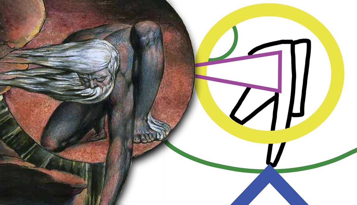
The Ancient of Days by William Blake is a piece in which the artist allowed basic shapes to dominate the work. In the prints we’ve looked at, the shapes have been a subtle aspect of the composition, but in this work, their subtlety has been stripped away as they’ve become part of the detail. It was created years before the rise of abstraction in Western art. Still, this piece uses the composition skills that would become fundamental to abstraction in modern art. Abstract art brings forward the basic shapes that are part of the structure of a composition and allows them to become part of the detail. It is a powerful piece of artwork with an equally powerful composition.

The figure reaches down, and the V shape points upward, creating a balanced tension between those two areas. Blake understood basic shapes, so he could make them a prominent part of the detail or a subtle aspect of the structure, and in this piece of art, he does both. The shape at the bottom is two sides of a triangle, and the viewer will look for other triangles in the structure. The purple triangle in the diagram shows how the man’s face and hair form the shape of a more subtle triangle that points left. The viewer follows that shape, and then the heavy detail of the circle captures their attention, so their eyes follow the circular shape. Then, they focus again on the subject matter that’s inside it, the figure of Urizen. Blake has created a true masterpiece.
6. Newton by William Blake

Newton’s pose is interesting because its structure is based on a collection of basic shapes. The curl of the back is a half-circle, and the positioning of the leg creates a partial square, with the tilt in the wrist creating another smaller partial square. Newton’s left hand is positioned to create the shape of a partial square, and his right hand creates the shape of a partial triangle. These small touches make his hands and the compass a more aesthetic focal point. The other focal point is Newton’s face, which looks towards the compass and links both focal points. When a character in a painting looks at something, it immediately creates an invisible leading line that sends the viewer to that area. In the diagram below, this line is shown in pale blue, and it completes the diagonal composition.

The diagram shows a red circle created from how the paper curls into a swirl. The lower right area of the print includes circles, triangles, and some partial squares, which stops the focal point from being boring because the subject matter is hands holding a compass, so it would be dull if Blake hadn’t designed such a brilliant structure. When the viewer looks at the details in Newton’s drawing, it contains a half circle, which is the same shape as Newton’s back, so the viewer is guided to look at that area. They follow the shape of the body towards Newton’s head, which is the other focal point. This creates a composition with two focal points successfully linked to each other. Blake had an advanced technical understanding of basic shapes and their relationship to composition, and simply viewing his work becomes educational.


