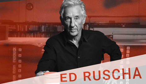
Ed Ruscha is an internationally renowned Pop and conceptual artist from the US. Since the 1960s, his practice has encompassed a huge range of media including photography, printmaking, painting and artist books. His diverse practice is united by a deep fascination with modern American life, particularly that of Los Angeles, where he has lived for most of his adult life. Because of this, many think of Ruscha as a Pop artist, who, like Andy Warhol and Roy Lichtenstein, draws on imagery from popular culture to make his art. But this is only partly true – Ruscha’s deadpan style, and his reliance on the ways text and language can interrupt the meaning of an image also makes him an early pioneer of conceptual art. We look at five facts about Ruscha to find out more.
1. Ed Ruscha Began His Career as a Graphic Designer

After studying painting, photography and graphic design at the Chouinard Art Institute (now California Institute of the Arts) in the late 1950s, Ruscha began his career as a commercial artist, paintings signs, and producing graphics for an advertising company. When he did begin moving into making his own art, Ruscha drew on this background in graphics, working with a clean, polished and carefully rendered style, in line with Pop artists like Andy Warhol and Roy Lichtenstein.
2. In the Early 1960s, Ruscha Started Painting Words

Ed Ruscha began working with painting and printmaking in the early 1960s. From this era onwards he developed his ‘word’ paintings, featuring a single word painted in bold text against a backdrop, which became a cornerstone of his artistic practice. The words he used, such as Honk, Smash, Noise, Oof, or Boss, were chosen for their direct, impactful quality, as well as their ambiguous meanings, which he left up to the viewer to interpret in their own way. Ruscha also admits he chose words with what he called a “certain comedic value.” Noting how humor crept into these works of art, he said, “I’m dead serious about being nonsensical.” Later, Ruscha began incorporating ambiguous or discordant longer phrases into his art, often over painted grounds featuring mountain ranges or hazy patches of color.
3. He Explored Deadpan Documentary Photography

Ed Ruscha took several large series of black and white documentary style photographs during the 1960s. He deliberately chose seemingly mundane subjects that might otherwise go unnoticed, challenging audiences to think about the subjects we are conditioned to appreciate and give aesthetic significance. He brought these photographs together into various self-published artist books. For example, in the publication Twenty-Six Gasoline Stations, the artist documented the many shabby, run-down gas stations during a road trip to Oklahoma City from Los Angeles in 1961. Meanwhile in the artist’s book Thirtyfour Parking Lots, he documented the many car parks of Los Angeles from a helicopter early one morning in 1967, before the city had woken up. The results were a series of ghostly, structural relics that offered an alternative and rarely seen view of Los Angeles.
4. He Designed His Own Font

Ed Ruscha designed his own font in 1982, called ‘Boy Scout Utility Modern’, and this became a recurring feature in his art. He designed the font by only using straight angles instead of curves, calling the text, “the kind of thing a carpenter might apply to making a letter form.” What he implies in this statement is the font’s deliberate lack of showiness, and instead its utilitarian, functional quality which relates back to the artist’s preference for deadpan, seemingly banal subjects, much like the art of many Photorealists.
5. He Loves Old Hollywood (and Other Nostalgic Motifs)

Ed Ruscha has spent much of his adult life in Los Angeles, and he is fascinated by the old-fashioned imagery of silver screen cinematography, or the so-called “Golden Age” of Hollywood. He has made many series of artworks featuring references to ‘the good old days’ of early Hollywood before mass capitalism took over. One of his most famous series in this theme is a group of works featuring the text ‘The End’ in various styles of typeface. Many times he has laid the text over backgrounds that look like old film strips, complete with scratches and stains, a nostalgic nod to the characterful nature of old film.