Color is one of the most important components of an artwork. It is used to describe emotions, places, and actions, and without it, the art world would look very different than it is today. Artworks weren’t always as colorful as they are today, but thanks to innovation and creative thinking, color in artworks has evolved throughout the ages and will continue to evolve in the future. Here is a comprehensive guide on the fascinating evolution of color in artworks.
Color in Artworks: The Paleolithic Paintings

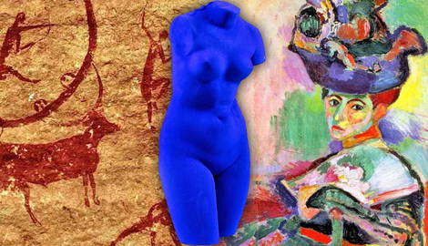
The Paleolithic era was when artists started using color in their work. Although primitive as it was, this was the start of the evolution of color in artworks. From as early as 40,000 years ago, the artworks of the Paleolithic era were characteristically created using natural and earthy colors like reds, blacks, and browns. This was because people used natural ingredients to create the paint. For example, burnt charcoal and soil were mixed with some type of binder like saliva and even animal fat.
The most commonly used color found in primitive cave art is red ochre, and the history behind how this paint was created is quite fascinating. Depending on where in the world you were, red ochre was made differently. In prehistoric Spain, red ochre was made from iron oxides found in the soil, such as hematite. This would then be mixed with a binder like saliva so that the paint could be sprayed from the mouth of the artist. Centuries later, in America, an insect known as a cochineal was crushed to create this pigment.

Taking a look at both sections of rock-wall paintings, it is very clear that the color red ochre was dominant in art. It was most likely fingerpainted. This marked the start of color evolution in artworks.
The Evolution of Color in Renaissance Paintings

The Renaissance era is possibly one of the most famous periods in art history thanks to artists like Rembrandt and Raphael. The Renaissance was also famous for another thing—the use of color to express emotion and religious imagery. Many artists like Rembrandt still used cochineal (red ochre) as a glaze in their artworks. This pigmented glaze was added on top of the previous layers to create a more vibrant and deep red. This deep and rich red can be seen in Rembrandt’s oil painting called The Return of the Prodigal Son. Even in the darkest sections of the work, there is a hint of red. This is thanks to that cochineal glaze that was so popular at the time.

During the Renaissance era, the color blue became more and more popular. While it was the Egyptians who pioneered the use of blue, known as Egyptian blue, the blue used in Sassoferrato’s The Virgin in Prayer seems much more precious.
The specific blue seen in the robe is known as ultramarine blue. According to the National Gallery, Sassoferrato acquired this color through a semi-precious stone called the lapis lazuli. This stone was only found in a mountain range in Afghanistan and was as valuable as gold back in the 1600s.
The Rococo Era Paintings

The Rococo era marked a new way that color was used in paintings. Gone were the dark tones of red ochre. Instead, this era saw an introduction of light and pastel tones. There was a gentleness and wistfulness in the paintings of this era that originated in Paris.
The color light pink, while not very popular during the Renaissance era, was suddenly in hot demand during the Rococo era and was seen in many famous artworks, including Jean-Honoré Fragonard’s The Swing and François Boucher’s many sensuous nudes.
The Swing serves as a perfect example of Rococo art. The light pastel pinks and oranges of the woman’s dress, her skin tone, and the small flowers scattered underneath her feet all represent the ideas behind Rococo well. The use of the dark but vibrant blue in the background serves to make the light pinks of the girl’s dress stand out.
The use of color during the Rococo era was very different from the Renaissance era. It was used to convey romanticism in the artworks. Pink was also used heavily because it was a symbol of wealth at the time.

Francois Boucher’s Portrait of Madame de Pompadour is an excellent example of the use of the color pink. During the Rococo era, the color pink was seen as a sign of wealth and was typically worn by royals and noble people. Boucher created a series of paintings of the chief mistress of Louis XV, Madame de Pompadour. She was a highly influential woman in court and was eventually promoted to Lady-in-Waiting to the Queen in 1756, the year Boucher painted this portrait of her.
In his artwork, Boucher used a light pink color for the frills and little flower buds that adorn the sitter’s dress. The ivory color of her skin makes the bright pink of her blush stand out against the darker background. The use of gold in the background of the painting is typical for the Rococo style, it helps the work seem whimsical and romantic.
The Impressionist Paintings

The use of color in artworks changed once again during the Impressionist era. Artists like Claude Monet and Pierre-Auguste Renoir favored brighter and bolder colors. Gone were the soft, whimsical brushstrokes of the Rococo era. Impressionist artists favored unbounded and textured brush strokes that were individually visible.
Claude Monet’s The Artist’s Garden at Giverny is a perfect example of an impressionist painting.
It’s got the bright use of color seen in the purple and blue flowers, the light blue and orange building in the background, and the multiple greens of the trees. Textured and quick brushstrokes were used here, which can be easily seen in the painting. Impressionist artworks focused on natural light and shadow, and this can be seen in Monet’s artwork in the top right of the painting. Monet’s piece embodies the busy and refined style of the impressionist era and is an example of how the use of color evolved.
The Evolution of Color in Fauvism Paintings

After the Impressionist era came a new art movement known as Fauvism. While Impressionism and Fauvism might seem very similar, there is one striking difference between the two styles—the use of color for depicting things in a non-naturalistic style. Both the Impressionist and Favism style of artworks focused on bright colors and textured brush strokes. However, the artworks created during the Fauvism era are brighter.
Matisse’s painting called Women with a Hat is a great example of how non-naturalistic color was used in this period. For example, when we look at the face of the woman in the painting we see multiple colors. There are bright yellows, blues, greens, and pinks. These colors are not something you would see when looking at this woman in real life. The use of color was bold in Fauvism and was sometimes used to shock the viewer.
The Evolution of Color in Artworks

The use of color in modern art has evolved to the point that artists now use color in any style and manner that they want. For example, Yves Klein’s sculptures took the world by storm thanks to his highly pigmented and aesthetically pleasing blue. Even though Klein focused on using one color in his artworks, the effect was astonishing. Looking back at the simple rock paintings of the Paleolithic era through to the bold colors of the Fauvist era, it is fascinating to see the way color has evolved throughout the years and will continue to do so.