American graphic designer Saul Bass was known for his involvement with the film industry, creating title sequences and movie posters for iconic works. He also designed many familiar logos and was an Oscar-winning filmmaker himself. He was an active artist for 40 years and collaborated with legendary filmmakers. Bass remains one of the most influential graphic designers of the twentieth century and is credited with the establishment of modern title sequence design as a respected art form. Starting as a freelancer and commercial artist, he became a significant figure in both the entertainment industry and the world of advertising. Here is an outline of his career as an artist and quintessential examples of his posters and title sequences.
Saul Bass’ Road to Recognition

Saul Bass was born in 1920 in the Bronx, NY to Eastern European Jewish immigrant parents. From an early age, his family supported him in his artistic dreams. At 16, he secured a fellowship to the Art Students League in Manhattan and began working in an advertising agency to save money due to the Great Depression. One of his jobs was to create posters for Warner Brothers movies. He attended night classes at Brooklyn College during this time, where he built an influential relationship with distinguished Hungarian designer György Kepes. Kepes taught him: The ideal trademark is one that is pushed to its utmost limits in terms of abstraction and ambiguity yet is still readable.
Bass relocated to Los Angeles in 1946 to continue his pursuit of commercial graphic design, producing promotional print work for Hollywood. Beyond involvement with film work, like creating posters for Chaplin’s Monsieur Verdoux, he ventured out into supporting other mediums such as designing covers for Art & Architecture and LP sleeves for Frank Sinatra. Inspired by the Arts and Crafts movement and the Bauhaus, he truly believed in the power of aesthetics to remodel society. In 1956, he began his own practice and founded Saul Bass & Associates. Around this time, he met his second wife Elaine, who became his collaborator as a title designer, graphic designer, and film director.

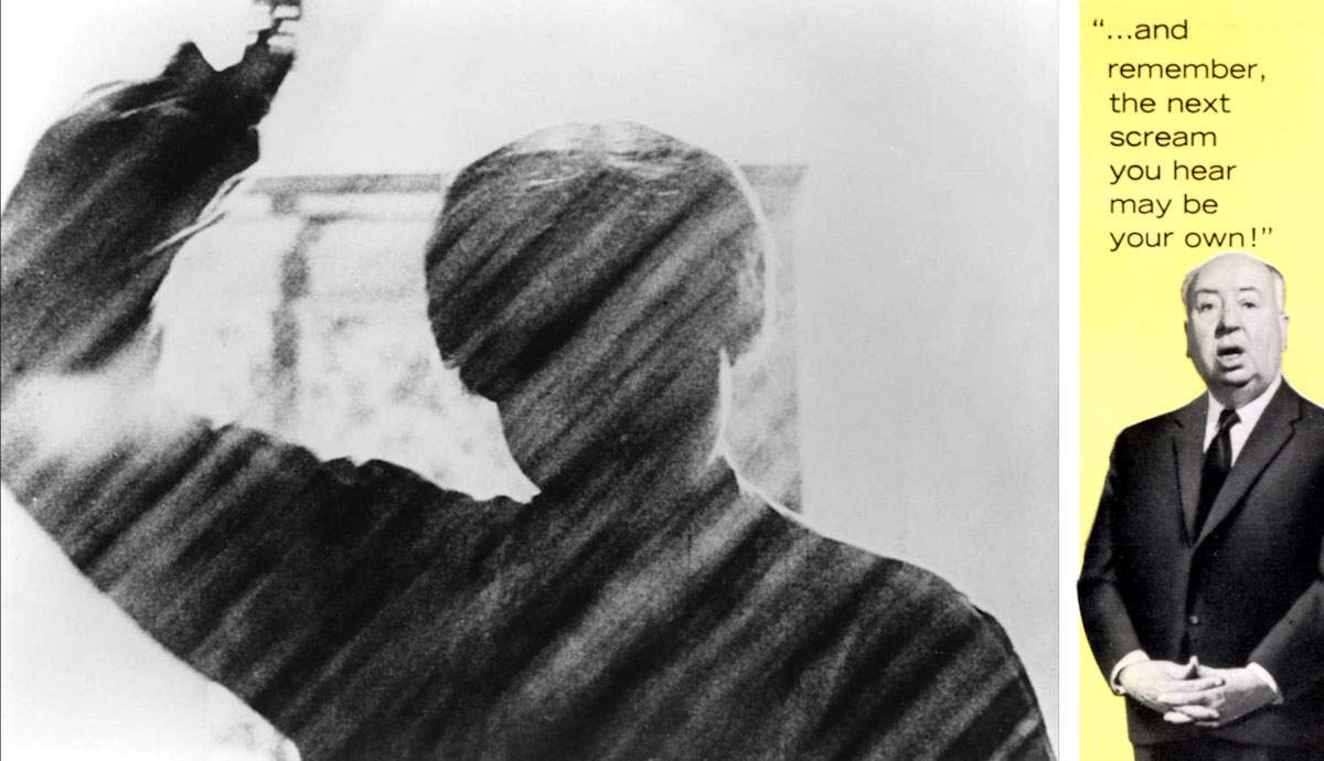
The first significant project that gained him recognition was the poster he designed for filmmaker Otto Preminger’s film Carmen Jones (1954). This collaboration revealed to him the potential of title sequences to provide a strong foundation for the story that followed. The assignment that helped him break into the industry of Hollywood was the title sequence he designed for Preminger’s The Man with the Golden Arm (1955). They would collaborate on eleven more films together. In wake of this success, he was sought after by renowned director Alfred Hitchcock to create title sequences for his films. Kinetic typography was a signature technique he employed that was novel at the time. The following creations are prime examples of the work that defined him as one of the most influential graphic designers of the 20th century.
Movie Posters: The Power of Minimalism

Anatomy of a Murder (1959) is a crime film directed by Otto Preminger. The story follows a court case debating the innocence of a young army lieutenant accused of killing a man who allegedly raped his wife. The poster depicts a stylized, dismembered human body that’s silhouetted against a red background. The fragmented figure represents the remains of the claimed dead body but also symbolizes the case itself.
The court attempts to piece together the scattered, contradicting accounts of the events in question. Even if the viewer visualizes the outlined limbs attaching back onto the body, the intact person would be disproportional and inexplicable. This discontinuity conveys confusion as witnesses’ stories don’t align. Bass integrates this clever double meaning that is portrayed through a simple but purposeful design.

Otto Preminger also directed Saint Joan in 1957 with Bass as a collaborator. The film outlines the life of Joan of Arc, a woman French leader in the Hundred Years’ War who was burned alive for heresy and dressing as a soldier. She is represented on the poster by a partial silhouette of her armored body holding a broken sword in the shape of a cross. The black profile is a bold statement of her strength and a testament to the brutality of her murder. Even in her final moments, she held true to her beliefs, which is illustrated through the tight grip of her sword.
The cross symbolizes her status as a martyr, sacrificing herself for the convictions of herself and her followers. The colorful pattern of squares in the background is abstractly modeled after medieval stained glass cathedral windows. This alluded to her canonization in 1920 and her sainthood that defined her life. The integration of a modern background expresses the timelessness of a story that took place in the 1400s. In addition to designing the title sequence for The Man with the Golden Arm (1955) as mentioned earlier, Bass created the promotional poster as well. The film deals with drug addiction, a taboo subject to explore in the media at the time.

The design isolates a silhouette of a disfigured arm. It’s depicted in a way that appears as if it’s undergoing a transformation into something monstrous. The jagged arm alone is a symbol of addiction. It illustrates the downward spiral it instigates, heightening the uneasy feeling it evokes with sharp geometric shapes. Surrounding the arm is the title in gold lettering. The gold represents the aspirations of the aspiring jazz drummer but also the heroin relapses he suffers from. The colored blocks are reminiscent of modern art and jazz, which align with the film’s aesthetic. This poster was revolutionary because it lacked the faces of the acting stars and instead used one symbol to capture the essence of the film.
Saul Bass’ Collaborations with Hitchcock

Master of suspense Alfred Hitchcock directed and produced the psychological thriller Vertigo (1958). The story follows ex-detective John Scottie Ferguson, who has a fear of heights that haunts him as his obsession with a woman named Madeleine becomes all-consuming. Bass created the iconic title sequence, which includes kinetic typography and innovative early computer graphics. Unsettling music builds in volume as an evocative shot of the human eye saturated in red lighting is superimposed with spinning spirographs in post-production created by animator John Whitney.
The spiraling visuals are hypnotic, simulating the dizziness experienced by the protagonist. The portrayal of fear as a vortex develops the ominous tone as the viewer is sucked into the black holes at the spirals’ centers. Even the enlarging motion of the title conveys the disorientation felt by Scottie as he becomes deeply obsessed with Madeleine. This is a perfect example of Bass’ ability to build anticipation and set the mood for the remainder of the film.

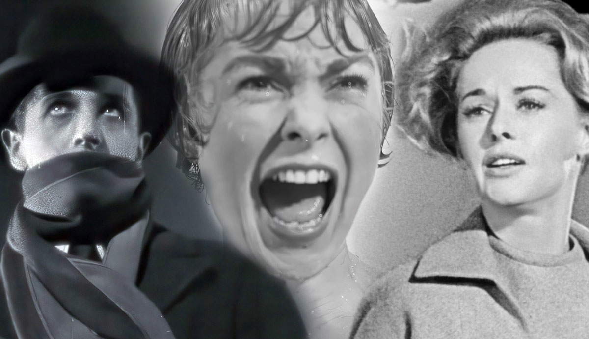
Another Hitchcock film Bass designed a title sequence for was Psycho (1960). The story surrounds the mystery of the Bates Motel and the off-putting relationship between proprietor Norman Bates and his sick mother, who live in a strange house that looms over the motel. The most significant and effective element of Bass’ title sequence is the minimalistic style that introduces the film’s main theme of contrast.
The parallel gray lines that move across the black background at a consistent pace combined with the horizontal shifting of the text portray a calculated yet unsettling conflict that shows up in defining dichotomies throughout the film. It is revealed that Norman has split personalities, which explains the murders he’s been committing without his knowledge of them. The dividing lines illustrate the two personas that exist within his mind and the use of gray portrays the ambiguity regarding the responsibility he should assume for his actions. The simple but brilliant design foreshadows the conflicts that follow.

His third film with Alfred Hitchcock was North by Northwest (1959), another prime example of his mastery of title sequences. In a spy thriller referred to as the first James Bond film, advertising executive Roger Thornhill is mistaken for a man involved in stopping the spread of government secrets. Diagonal and vertical lines drawn in blue over a green background intersect, fading into an outline of live-action skyscraper windows in Manhattan. This transitions into bustling downtown scenes capturing the chaos of city life.
With the unpredictable turn of events for Thornhill, his life collides with his love interest Eve Kendall’s life. His fate determined by the strange path he was forced upon is portrayed through the intersecting lines that represent all the different directions that individuals’ lives can take them. Intersecting lines can also be drawn from the fast-paced movement of people walking in the city. Another symbolic takeaway can be observed through the transition from an abstracted version of the building to the real one. Thornhill’s identity evolves throughout, and his experience gives insight into his reality beyond his polished appearance.
In addition to his prolific portfolio of film posters and title sequences, he also developed many recognizable logos and directed films himself. From the AT&T logo to his artistic documentary Why Man Creates (1968), Bass was a highly versatile designer with an extensive collection of works. His combination of expertise in motion graphics and traditional mediums of drawing defined him as an artist with impressive range. The timeless style he mastered continues to influence graphic design today in the digital world and in print media.