
René Magritte gave popular culture his unique perspective, and it has enhanced every aspect of our visual experiences, becoming the inspiration for everything from advertising to horror films. His unique vision has been constantly repurposed to speak to a contemporary audience. His paintings contain ideas and concepts that are witty, intellectual, and enduring. Magritte could combine visuals in technically skilled ways, and his approach to composition is worthy of exploration.
1. The Beautiful Promenade by René Magritte
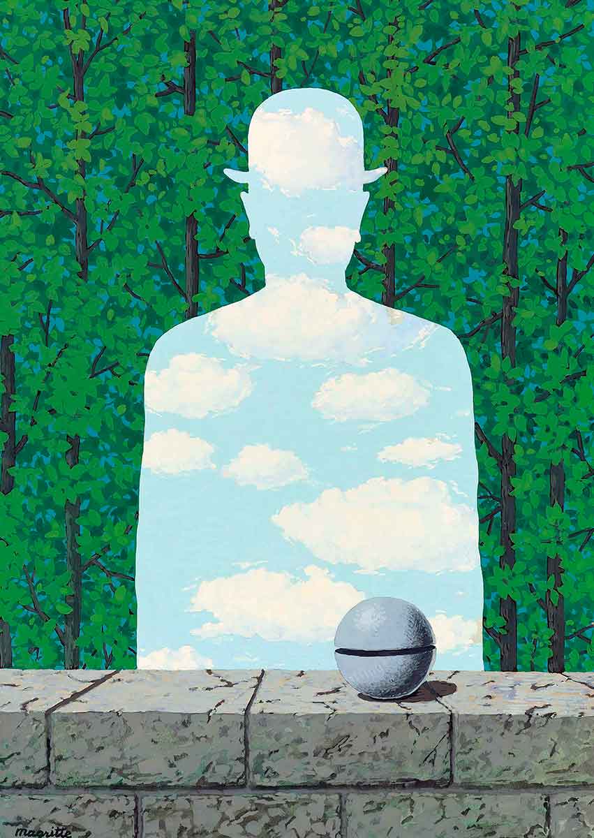
The man in a bowler hat is a common visual symbol in Magritte’s work. One of his skills was taking a piece of visual imagery and using it in multiple ways. The work is surrealist, so it contains dreamlike imagery that is familiar yet distorted. When looking at his artwork, you’re entering his visual language, so there is no reason a person can’t be a silhouette of the sky.
Magritte’s techniques were grounded in realism, and he combined symbols as if he were collaging. He also used this medium, and in collage, the juxtaposition creates interesting connections between the symbols. When an artist uses collages to train their composition skills, they develop their ability to position the elements of composition in more complex and exciting ways.
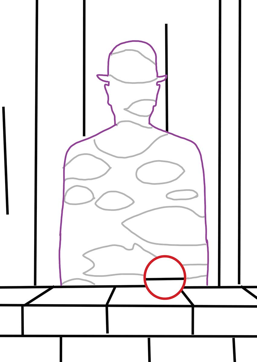
The symmetrical silhouette has the same elements on both sides of the painting. This perfect balance is then disrupted by the surroundings. As the diagram shows, the lines of the trees are different on each side of the painting, but there are the same number of lines on each side of the silhouette, making them partially symmetrical. The circular object in the foreground is a familiar shape that disrupts the symmetry of the painting.
Magritte was playing with the viewer’s expectations due to their preconceptions of portraiture. They presume the figure is the focal point, so they’re looking for symmetry in other areas, but it isn’t there. The circle boldly disrupts the symmetry of the overall painting, making that object a focal point. This gives the work two focal points and raises questions about what a portrait is.
2. L’Amour de la Nature
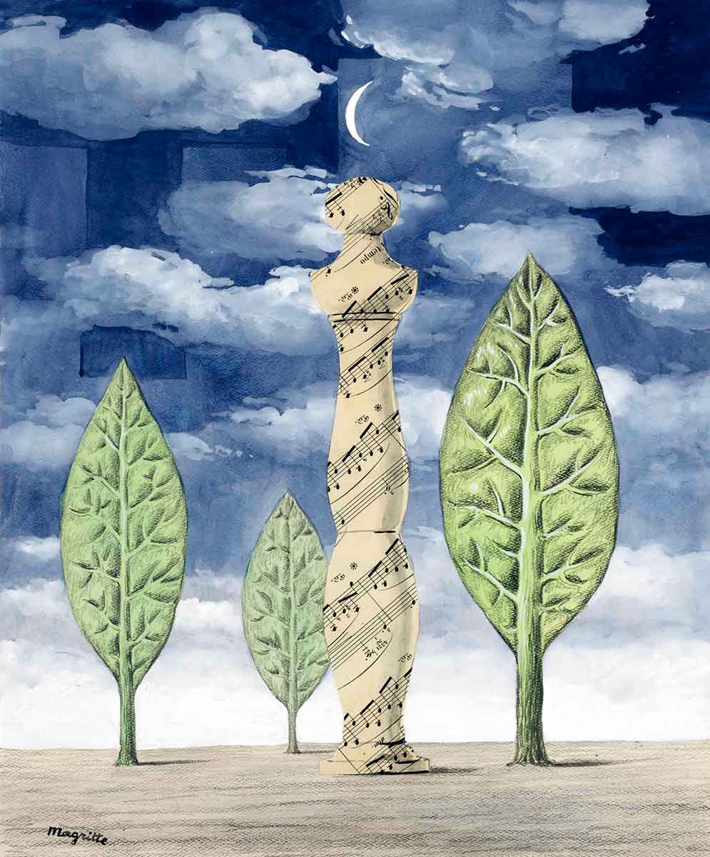
This work is part painting and part collage, including charcoal and pencil. Sheet music was added as a piece of collage. The sheet music and the moon are the focal points of the composition. The heavy detail is balanced by the white space in the lower part of the work, which is highlighted by the white of the crescent moon at the top of the work.
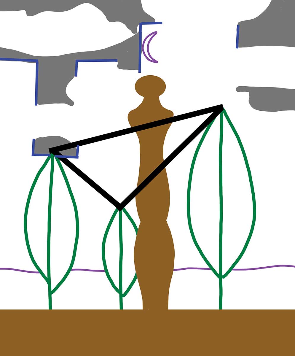
The brown in the diagram shows how the sheet music silhouette and the floor share a color that forms an inverted T shape. The inclusion of basic shapes in the structure of a composition can enhance a painting. Magritte also layered these basic shapes because when a composition element is given a clear basic structure, it creates complexity without becoming messy and disorganized. In the diagram, a black line unites the tip of each leaf, creating a triangle to show that the leaves have a triangular structure in how they are positioned. Including this basic shape has led to a more interesting and cohesive composition.
3. La Mémoire
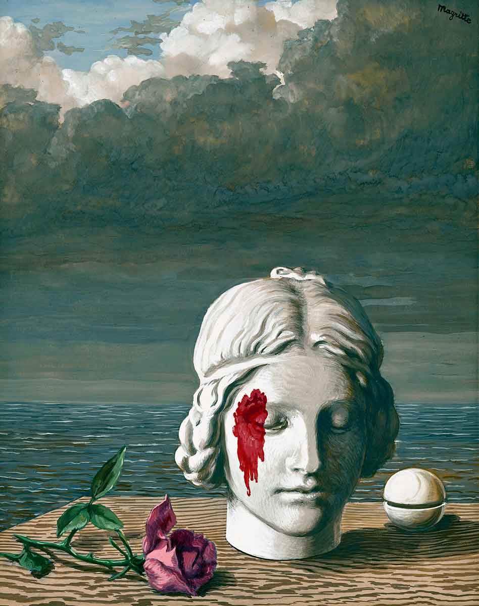
René Magritte created surreal artwork, and his approach to composition can be as surreal as his imagery. Surrealist paintings contain visuals that are combined in unusual ways. Still, the composition is usually standard, and you can often see familiar approaches to composition, but René Magritte had a different approach that could be considered surreal. When an artist creates a piece of artwork in portrait format, that initial shape becomes part of the composition. A portrait format canvas can contain more composition elements and details in the top half of the canvas. When an artist places too much in the lower half, it becomes unbalanced. In this work, Magritte purposefully placed all the main details in the lower half of the painting. The imagery and composition are both unsettling, which means they both work towards the same objective.
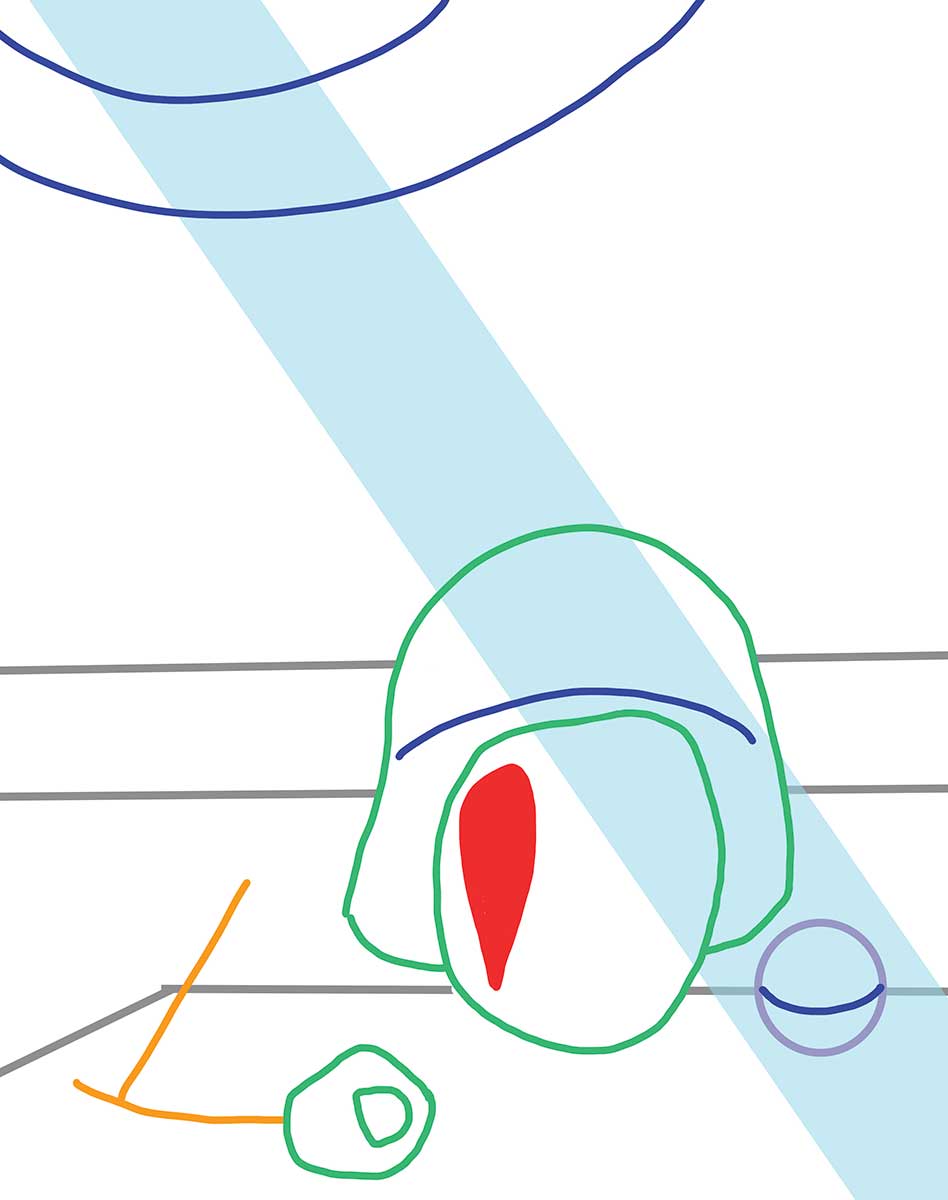
René Magritte aimed to make viewers feel unsettled as if they’d experienced an uncomfortable dream that lingers throughout the day. Going against all the rules of composition wouldn’t achieve that effect, so Magritte added some tried-and-tested techniques. A composition can be improved by repeating shapes, and the green lines in the diagram show a similarity between the shape of the head and the rose. This unites those parts of the canvas.
The dark blue lines also show a series of curves that are an important part of the composition’s structure. They are positioned diagonally, which adds more interest and balance. The combination of technique and a subversion of technique creates an unsettling feeling for the viewer. Magritte was finding a balance between good and bad composition to create a painting that rests within a sense of unease, something a lesser artist wouldn’t ever consider.
4. The Poetic World II
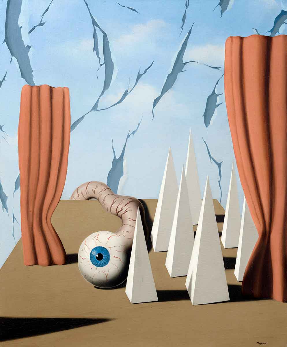
In this painting, the dark subject matter is contrasted with the light tone of the painting. Surrealism as a style can drift into nightmarish imagery, and skilled surrealist artists have created bodies of work that contain a broader array of experiences. Magritte could create different experiences for the viewer, but his ability to create unease is unparalleled. In Le monde poétique II, Magritte balances the disturbing imagery of a detached eye with a familiar everyday object, a pair of curtains. The work’s focal point is the eye looking straight towards the viewer. Blue is the most intense in that area, which pulls the viewer’s gaze to the focal point. The eye contains black and white, so the viewer will look for those colors in other areas of the canvas, looking at the dark shadow in the lower left or the white pyramids.
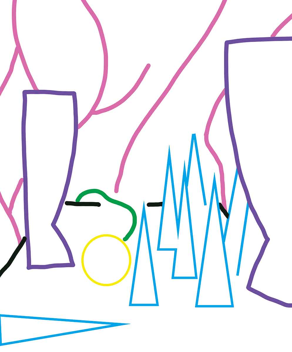
The blue lines show the triangle shapes in the painting. Most are created from the white pyramids, although the one on the lower right is where Magritte has painted a shadow. The shape of the shadow points right, and then the viewer’s gaze curls around the circle towards the other triangles, which point upward. The rips in the sky curl towards the right. The viewer can still see that aggressive shadow in their peripheral vision, so they are guided to look right towards the curtain. When they look at one curtain, they will gaze at the other. The flow of how the viewers are guided isn’t smooth because the eye is so dominant that it constantly pulls the gaze back. It creates an experience where the viewer zig zags to various parts of the painting as though they’re trying to avoid the intense stare of that eye.
5. La Clairvoyance
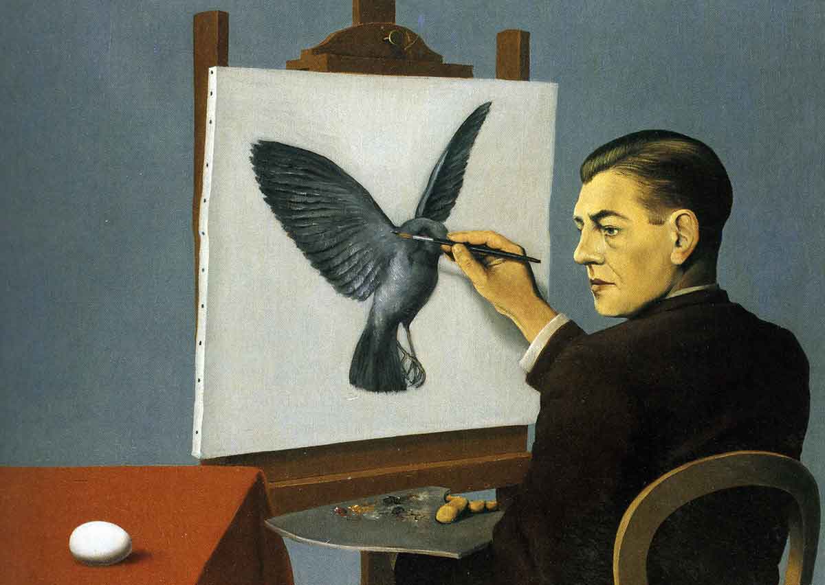
This painting of clairvoyance captures Magritte’s wit and humor. Some people believe Magritte was declaring his genius by depicting himself as painting the future, but that dismisses the humor in this work. Magritte showed his versatility when he created paintings that could be seen as humorous because painting is a medium inflexible to jokes. Magritte has a dry, serious delivery with a stern face and realistic depictions, and this is an aspect of comedy.
Some of Magritte’s paintings contain humor, others are highly intellectual, and some are both, but they all have excellent composition. There are three focal points here: the face, the bird, and the egg. The focal points are at different heights, creating a triangular composition. Black and white are also placed in a triangular manner. The flesh color is balanced by the coloring of the tablecloth on the lower left.
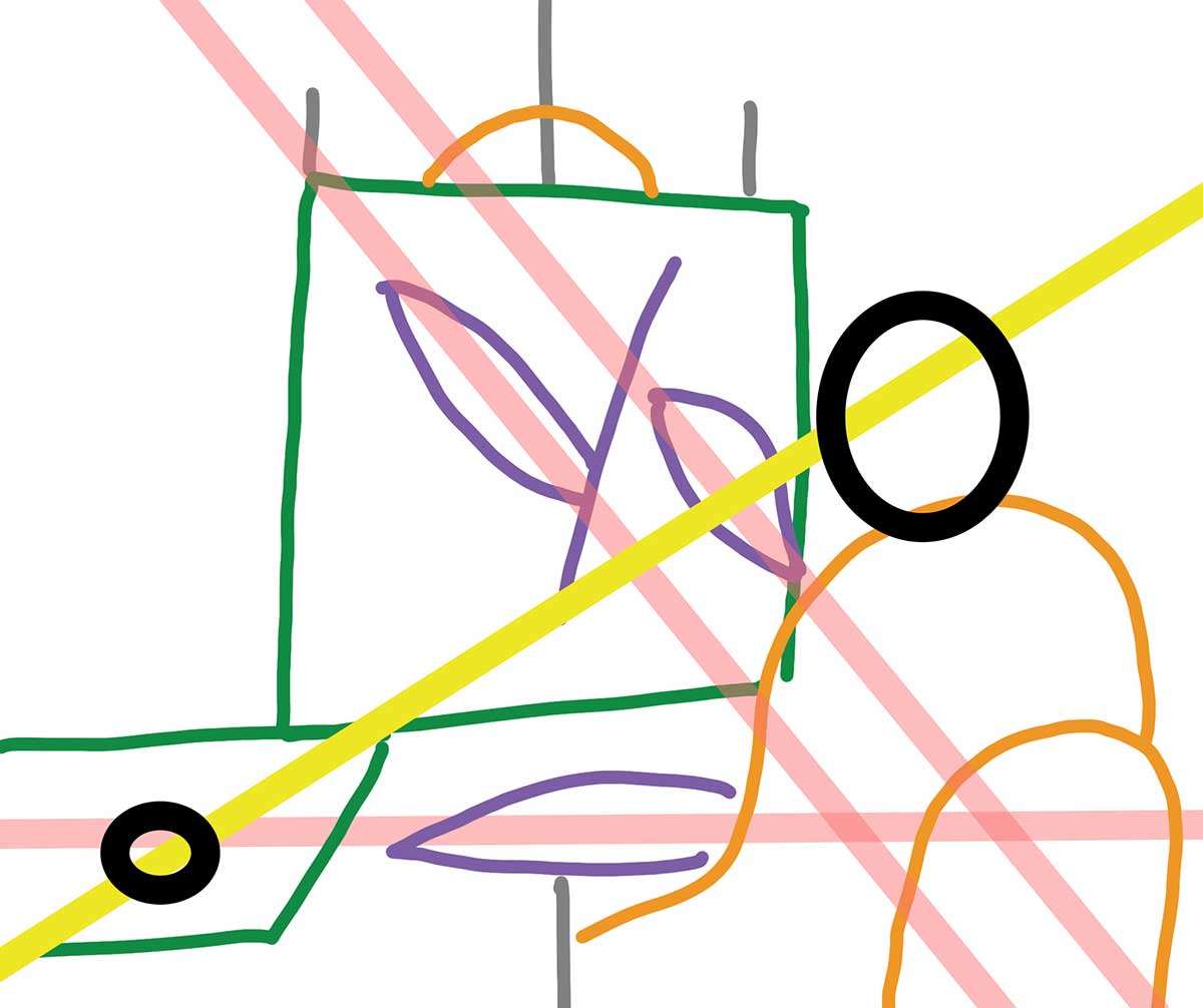
The diagram shows a line from the face to the egg, and this is because the gaze from a person in the painting will always create an invisible leading line that unites both areas. The viewer will follow the gaze of any figure in a painting, so it becomes an important aspect of composition. The diagram shows three purple leaf shapes where the subject matter loosely shares that shape, and these point in different directions, so a pink line shows the directions they point to. The palette creates a horizontal that points to the egg, and the shape of the hand and the bird’s wing creates two parallel diagonals. The structure is a layering of similar triangles that could be seen as one large triangle. This simplistic structure makes the composition perfect for a painting that is direct in its message.
6. L’Endroit du Décor by René Magritte
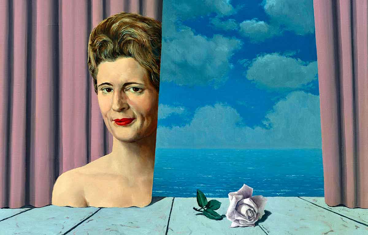
This portrait of Marianne Tagnon is another work with three focal points at different heights, so it’s another triangular composition. The moon is a focal point, and the viewer’s eyes are drawn to that area because the contrast between light and shade is more extreme in that part of the painting. The viewer only sees part of the woman, which links this subject matter to the moon because it’s a crescent moon, so it’s only partially visible. The shape of Marianne also curls left like the moon. She’s contrasted with a rose positioned as though it has fallen to the right, so the upper two focal points pull to the left, and the lower focal point anchors the painting to the right. Magritte created an experience for the viewer where their eyes drift upwards. At the same time, their gaze is also anchored by the rose.
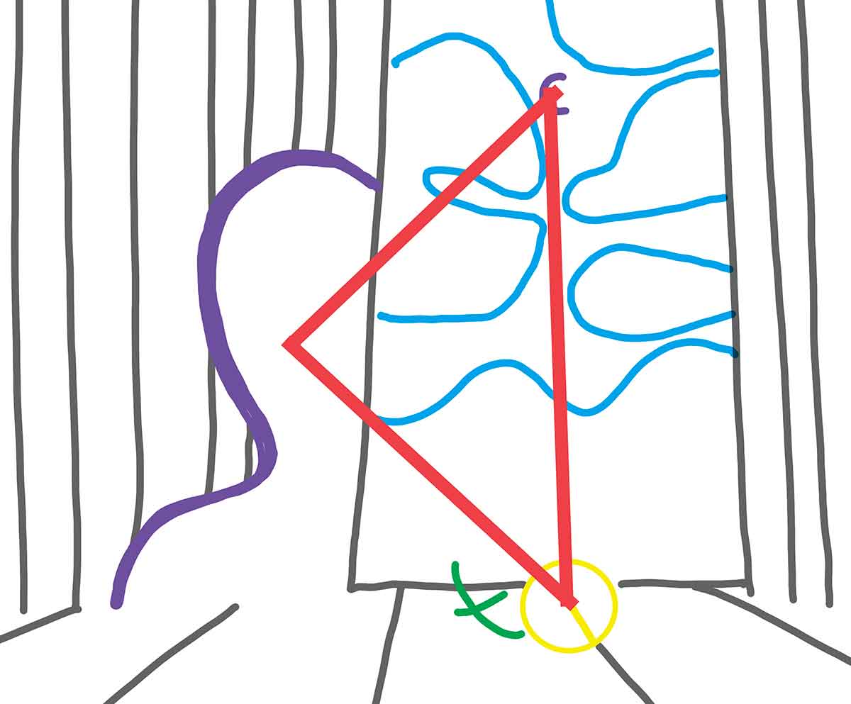
The head of the rose points towards the line of the flooring, which gives it more weight so it can balance all the subject matter curling to the left. Magritte also added leaves and a stem to the rose, so they have an X to their shape, as shown in green on the diagram, and this adds additional weight to that area, pulling the viewer’s gaze back. The blue lines show that the clouds are also shaped to curl left, so the third focal point of the rose is doing a lot to balance and unify the composition. This composition creates tension where the viewer drifts while also being pulled back. It’s the perfect composition to portray something as desired but unattainable. Magritte was skilled at compositions that thoroughly considered the perspective of the viewer.