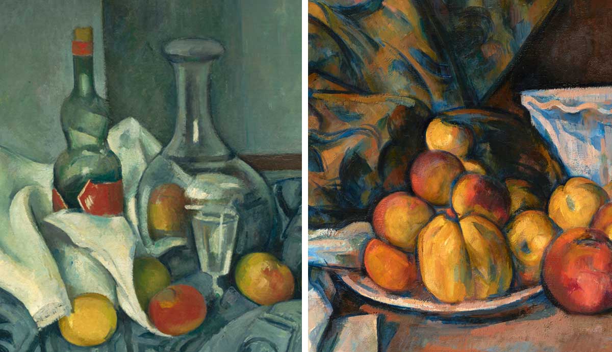

Paul Cézanne’s artistic legacy is immense. Even if a contemporary artist doesn’t identify him as a direct influence, they will still know how he shaped the work of many of their favorite artists. Often referred to as the father of modern art, Cézanne transformed what art would become, and there are many reasons why he has this reputation. In this article, we will look at his approach to art composition. How did he create a masterpiece?
1. Paul Cézanne’s Madame Cézanne
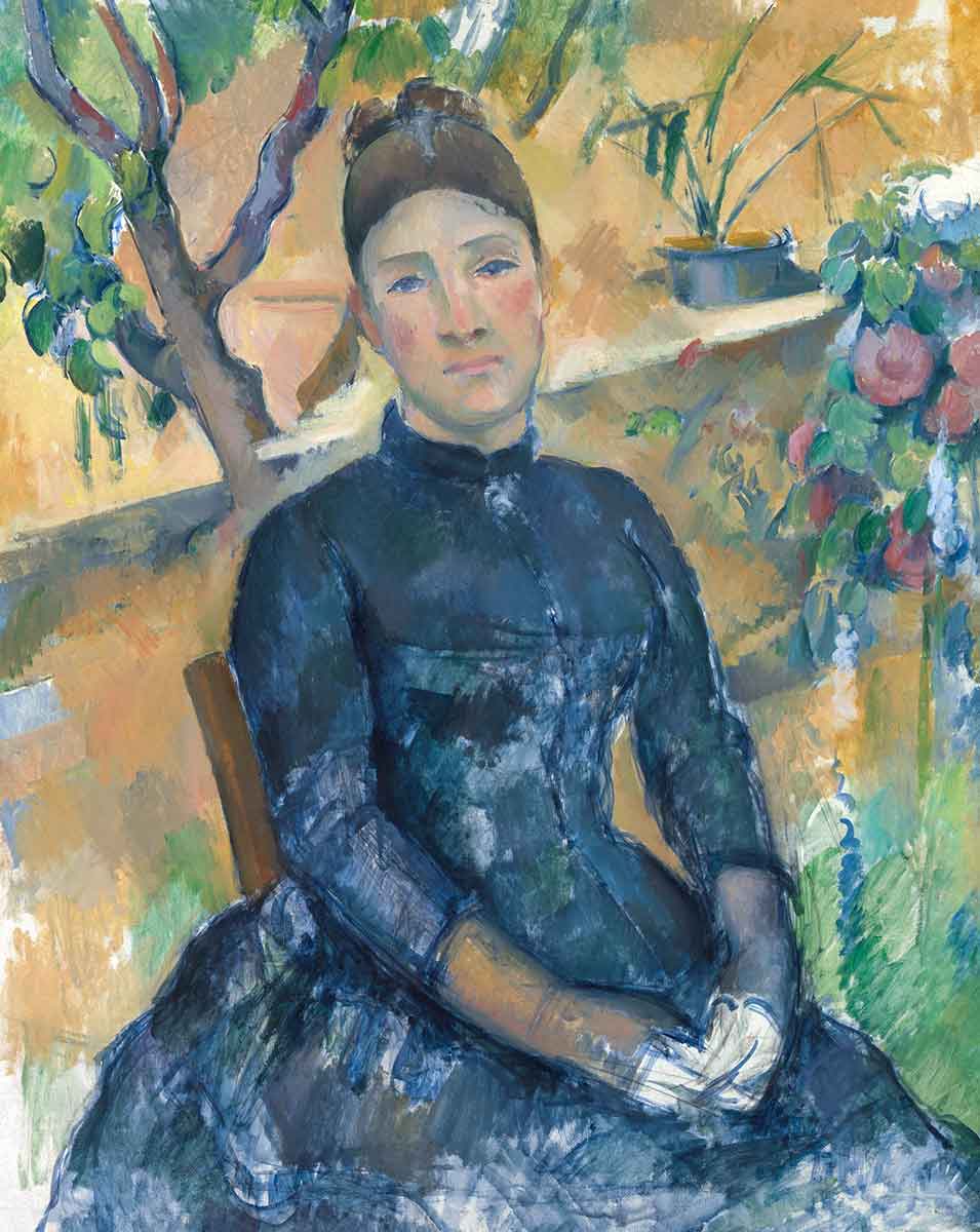
This is an affectionate portrait, and the composition seems simple. It can be seen as a triangular composition where all the important subject matter is within the shape of a triangle. However, Cézanne’s approach to composition was more complex. The woman is the focal point, but not every part of her body because the viewer isn’t guided to look at her dress at the bottom of the canvas.
There is a roughness to the marks that Cézanne created in that area. A portrait canvas can handle more artistic elements in the upper half of the canvas, and this composition relies on that. The positioning of the reds and pinks encourages the viewer to look at the face. The red flowers on the right connect to the colors in her cheeks. The background is mainly orange and yellow, but when you look between the branches of the tree, you can see that pink has been added to the orange. There are also dashes of red in the brown of the branches. It’s a diagonal flow of reds and pinks with the woman’s face in the center.
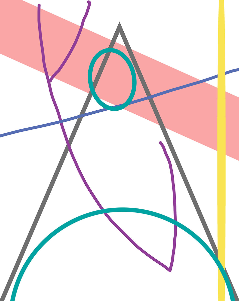
In the diagram, the pink diagonal line shows the positioning of the pinks in the work, and the blue line highlights a prominent diagonal line in the painting. Both lines cross, but it’s subtle because one is constructed from color positioning, and the other is a line in the brushwork. They cross near the face, which helps define that area as the focal point. The purple lines show the line of the branches and how the line extends to the shape of the woman’s arms. Her brown sleeves emphasize that line, so when the viewer looks at the lower half of the work, this line guides their eyes back up to the focal point. The purple line also crosses the blue line. This means there’s a cross on the left of the face, as well as the right. All that activity pushes the viewer to focus on the face.
2. The Large Bathers
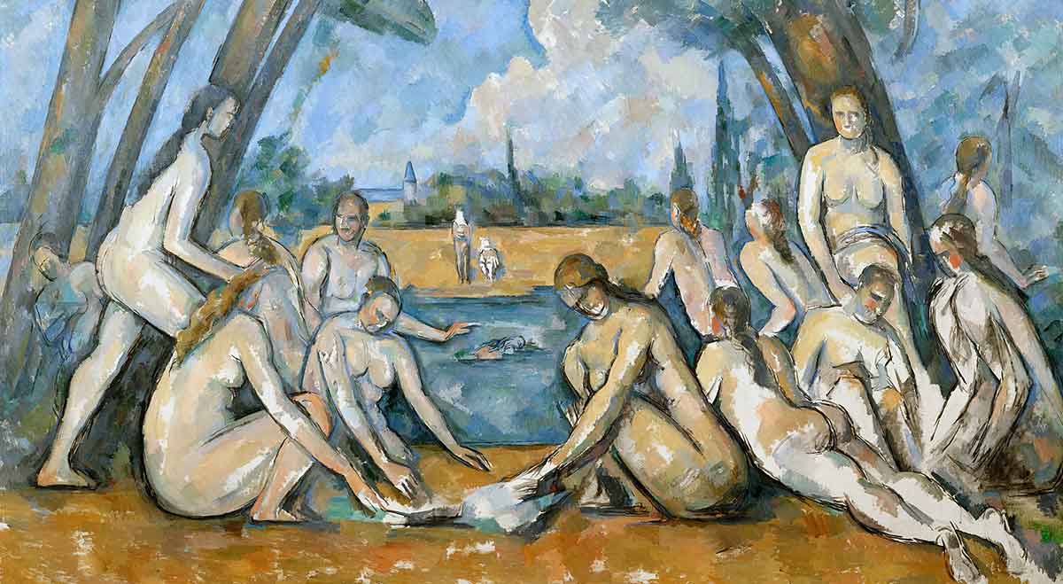
The Large Bathers is another figurative work by Cézanne. It’s in landscape format, meaning it can handle many artistic elements in the lower half of the piece. The shape of the canvas is the first shape an artist must learn to balance, and Cézanne would choose a suitable composition for the format.
If you were going to reduce this picture to its two main colors, they would be orange and blue. There are browns in the work, but Cézanne chose a brown that has a closer relationship to orange rather than red. This is a sensible choice because blue and orange are complementary colors that work well together, giving the composition more cohesion because they balance so beautifully.
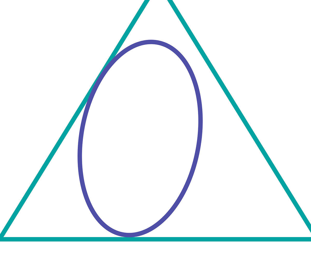
The diagram shows the composition combines two basic shapes, the oval and the triangle. Basic shapes give a painting a clear structure. The triangle is the most prominent. It’s created from the positioning of the people and the trees. The oval is made from the curve of the women’s arms and a few strategic branches. A composition can be improved by combining basic shapes with contrasting attributes, so the angular triangle is contrasted with the curves of the oval. The details follow this structure, bringing more balance and interest to the piece. If the basic shapes had been layered on top of each other, it would’ve added to the level of complexity and disrupted the feel of the piece. It would’ve created specific focal points that would stop your eyes from casually circulating the canvas. Cézanne’s painting creates a simplistic and peaceful experience for the viewer.
3. Still Life with a Ginger Jar and Eggplants
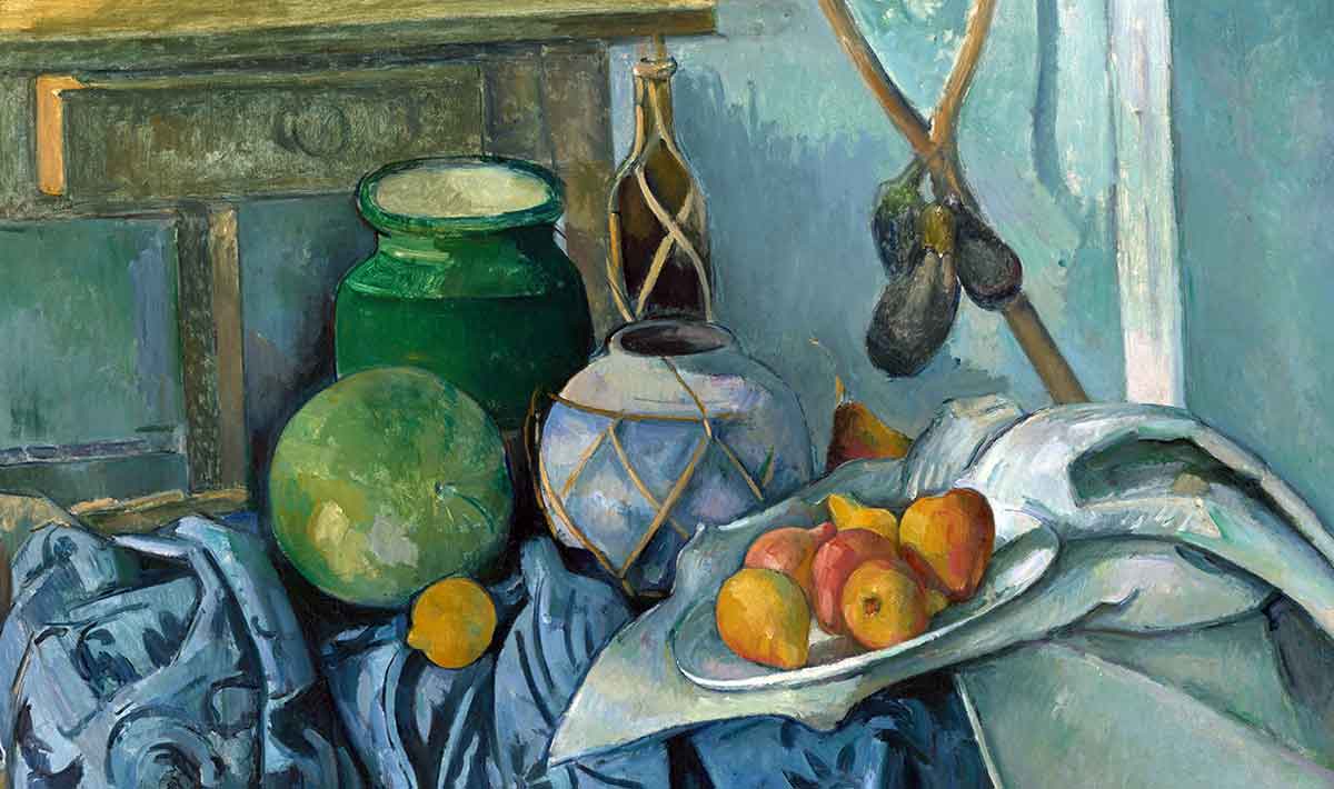
Still life is a form of art that pushes the artist to develop and explore composition. The artist also chooses shapes and colors through the selection of objects. The artist can set up the objects and try different alternatives. Cézanne’s compositions are more complex in his still life paintings.
This work is dominated by cool colors, making the fruit’s warm colors stand out. The viewers’ eyes are drawn to the plate of fruit. They are guided by the colors and also the composition structure. The branches of the eggplant form a triangle that points to the focal point, and the shape of the material also forms a triangle shape that points to the plate. In the diagram below, these are shown as green triangles.
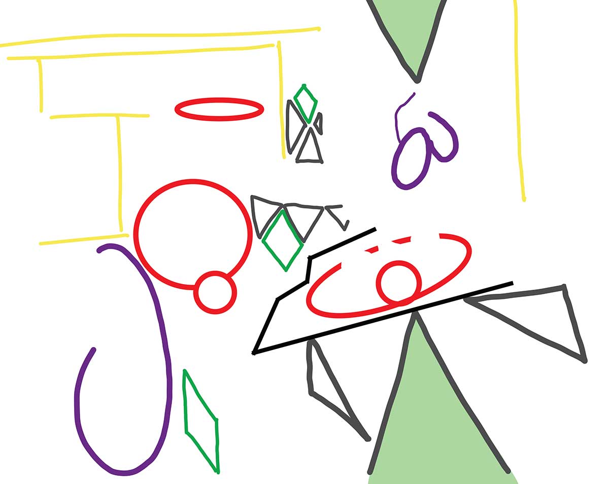
In the diagram, the shapes of eggplants are shown in purple. The same color highlights where the shape is repeated in the lower left corner, where Cézanne used the curls in the material to repeat the shape of the eggplant, which connects those two areas of the canvas. Suppose a viewer is looking at the lower left. In that case, their eyes will be guided diagonally because the same shape is in their peripheral vision. The diagram also shows three diamond shapes that are positioned diagonally. On the bottle, the pot, and the shape of how the material is folded.
The plate is at an angle, and the material on which it rests has a shape that points to the lower left corner. The content in that area then sends the viewer’s gaze through the diamonds and back up to the eggplants. The focal point is the fruit on the plate, but it isn’t a fixed focal point because it points the viewer away, and then they are guided back.
4. Still Life with Apples and a Pot of Primroses
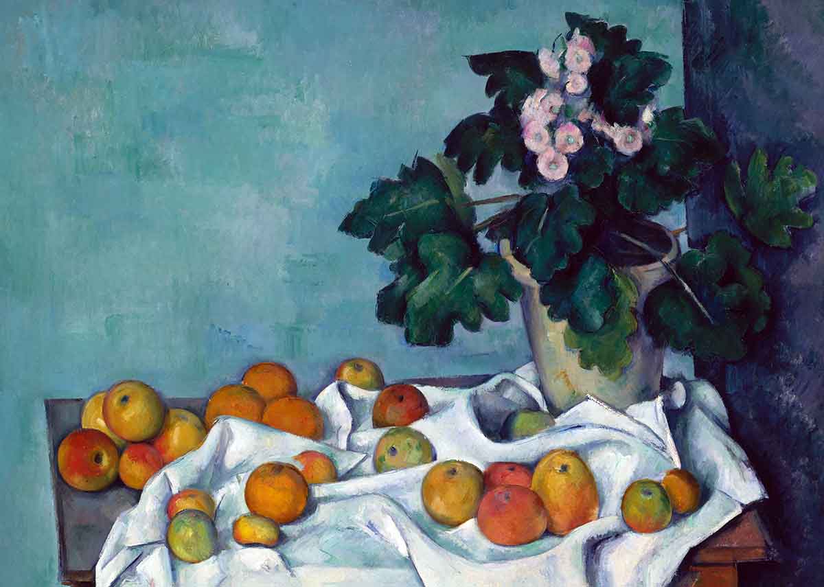
The objects are positioned in a backward L shape. This basic shape is the backbone of the composition. In Cézanne’s painting, he added splashes of color that extend beyond the confines of the subject matter. If you look at the material on the lower left, a faint red line points to the apple on the far left, and the white material has green and blue shadows. Cézanne would take an object, and then he would stretch its colors and shapes to other areas of the canvas. The placement of the red line is essential because it points to the red apple, where red is the most intense. Red is the complementary color to green, which is more intense in the leaves of the primroses. This use of color balances both sides of the canvas.
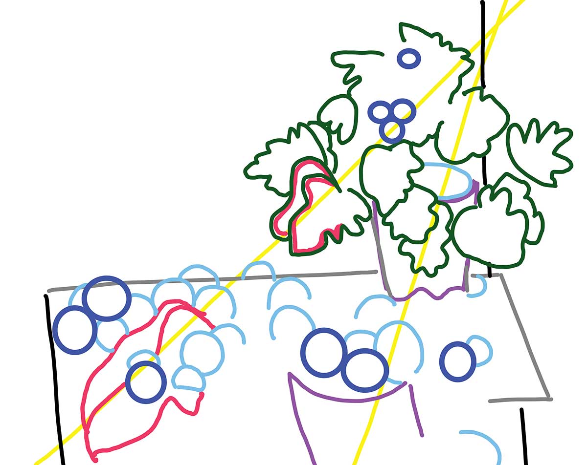
The diagram shows how Cézanne repeated and extended the shapes beyond the subject matter. The pot is shown as a purple line, and the same color also shows how the shape of the pot is repeated in the shape of the material on the table. When the viewer looks at that area of the material, their eyes become guided to look at the pot. On the diagram, the color red shows where Cézanne used the same technique with the shape of the leaves. One leaf points towards the bottom left of the canvas, and its shape is then repeated in the shape of the material. Again, Cézanne used a diagonal placement for the shape. In the structure, two diagonals lead the viewer towards the focal point, the plant.
5. The Montagne Sainte-Victoire with a Large Pine
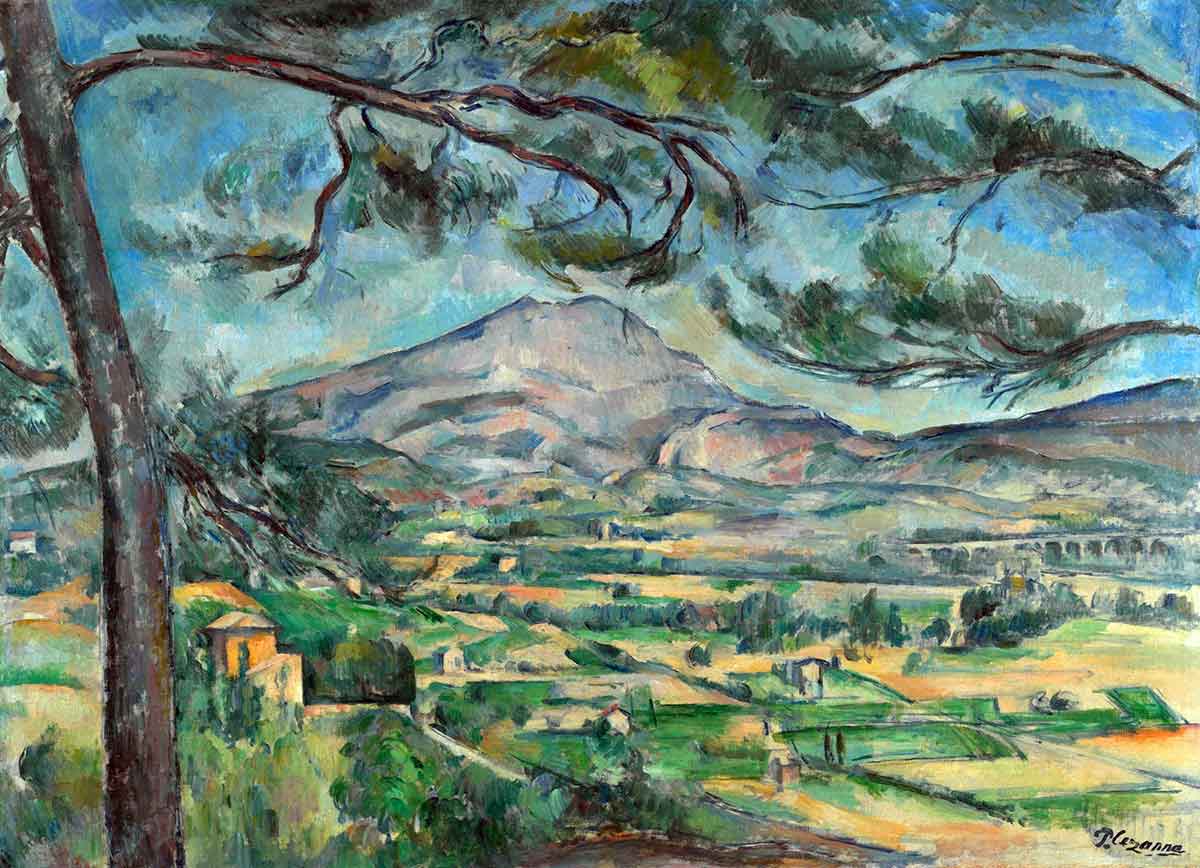
Cézanne painted the same mountain on multiple occasions. When Cézanne painted apples, he placed them at different angles and explored various perspectives. Cézanne used the same approach when painting the mountain because there isn’t one perspective of the mountain, and one subject matter can lead to multiple compositions. When the mountain is viewed with a large pine, that addition to the structure alters the composition. One of the branches is painted so it curves into the line of the mountain, making both objects emphasize the shape of each other. The line of the mountain is the focal point, and its dark edge is enhanced by the light in the sky.
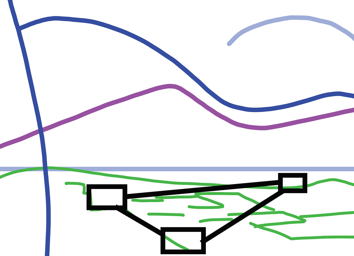
The black squares in the diagram show three dark areas in the lower part of the canvas, which balances the dark areas in the top half of the painting, where the branch above the mountain is particularly dark compared to the rest of the work. The positioning of the dark areas in the lower half is particularly clever because they are in a triangular shape. The mountain has a soft triangular shape, and the introduction of another triangle emphasizes that shape because the triangle is an inverted version of the shape of the mountain. It’s common to see landscapes where the reflections in the water add more complexity and interest to the composition. Cézanne used that technique without having a body of water in the subject matter. A subtle version was created through variations in light and shade.
6. Paul Cézanne’s Mont Sainte-Victoire

This is another painting of Cézanne’s favorite mountain. Repeatedly painting the same subject matter is an obsessive tendency, but it isn’t just a passion for the subject matter. In Cézanne’s paintings, you can see an obsession with perception, shape, and line. When Cézanne created his masterpieces, he shared his observations and invited viewers into his explorations.
This painting has a different composition from the previous one. The brushwork is tighter and more angular, and the painting has a different balance between realism and abstraction. In the details, two shapes can be recognized as buildings, and the composition diagram below shows these areas as two black circles.
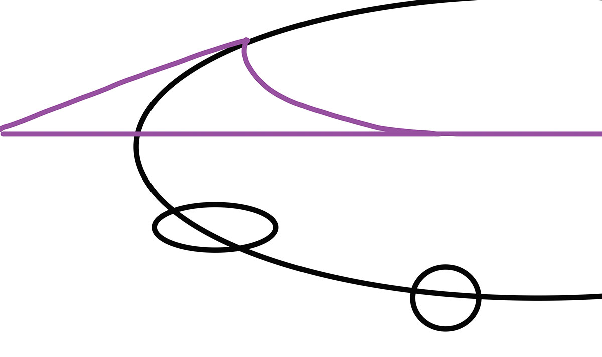
Their positioning could be seen as diagonal, but if you combine those two areas with the mountain, you can see that the structure curls to emphasize the mountain’s curve. A painting must balance curves and angles because they are related elements of a composition. In this painting, the curve is in the structure of the work. That large curve is then balanced by all the angles in the brushwork, creating an aesthetically pleasing piece.
Even when the painting seems simplistic, it’s been designed with immense skill and ability. Cézanne’s compositions are genius. He combined many artistic elements into subtly complex compositions that can be appreciated on multiple