The works of Hirohiko Araki span decades but there is one thing that has remained consistent upon the honing of his craft, his references to pop culture, art, and fashion. This manga creator, this illustrator, this designer sought to bring something different to the medium, and in doing so Araki created a brand that is unforgettable and eccentric. His references are so versatile and so striking that his work culminates into something that has been revered as high art by many and loved as a pop-culture phenomenon.
What Is Manga?

There are a lot of misconceptions as to what manga really is, with definitions varying from black and white comics, to strictly Japanese comics, to even a specific style. The closest definition includes any printed animated media within Japan. Manga was not established as a kind of overarching style until the “Godfather of Manga,” Osamu Tezuka, developed new techniques and redefined already established genres with works such as Astro Boy and Jungle Emperor Leo in the 1960s.
Most people outside of Japan, and many inside, go by the latter definition and believe manga to be a form of media that you know when you see. Nowadays, mangakas, or manga artists, have so many varying styles that it would be ignorant to attempt to define manga strictly by some of its more known stereotypes, like large eyes, spiky hair, and crazy proportions. There are manga that do indeed still find appeal in all three attributes, in some way, but using these as a basis as to what manga is would be discrediting artists like Takehiko Inoue, Shinichi Sakamoto, and, of course, Hirohiko Araki.
Who Is Manga Artist Hirohiko Araki?

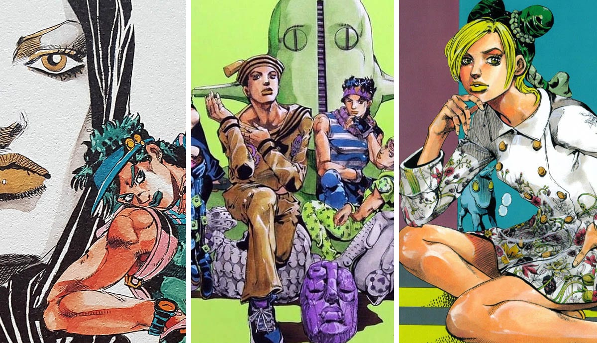
Hirohiko Araki is a manga artist in Japan best known for his ongoing work and magnum opus, Jojo’s Bizarre Adventure, which began publishing in 1986 but debuted in the early 1980s. He takes inspiration from classical techniques in paintings and sculptures, the color manipulation of Paul Gauguin, Western pop culture, and fashion to create an engaging world and characters.
He was born in Sendai, Japan on June 7th, 1960, and drew his first manga when he was only in the 4th grade. After an interaction with a friend, who complimented his work back then, he thought that taking on manga as a future career was an option to look into. In the 60s striving to become a manga artist was something that people looked down upon, as it was not a conventional career path. So, Hirohiko Araki set about practicing his art behind his parents’ backs and eventually submitted his first work during high school— it was soundly rejected along with many other submissions. Eventually, he received recognition for his Poker Under Arms as a runner-up to a manga competition known as the Tezuka Awards.

Despite making his debut Hirohiko Araki knew that he needed to create a style that was unique and distinctive if he wanted to truly stand out in the industry. Poker Under Arms’ style is very indicative of the 1980s lacking the overarching uniqueness he hoped to achieve later. After the early advent of manga as a style, there was something akin to an industry standard for how certain genres and works within certain publications had to look. So, it was not out of the ordinary to view works that had eerily similar styles; Hirohiko Araki’s decision to branch out style-wise was a smart one, as his work could have been lost in a sea of uninventive works regardless of the story his art told.
Influences From Paul Gauguin

Paul Gauguin was a French artist best known for his Post-Impressionist works and his help in pioneering the Primitive style. After the conception of his The Vision after the Sermon (Jacob wrestling with the Angel) in 1888, Gauguin declared himself a Synthetist. Synthetism was known for its flat areas of color and bold outlines which can be seen throughout Hirohiko Araki’s later works. During a lecture, Araki stated that he was fond of Paul Gauguin since he was a child and eventually used Gauguin’s Impressionist and Post-Impressionist pieces as inspirations for his later work. What inspired Araki the most about Gauguin’s work was the use of color-blocking and the lively use of unrealistic color. He appreciated the idea that the ground [could be] pink and the trees [could be] blue.
Where Can Gauguin’s Influences Be Seen?

The better question is: Where can’t it be seen? But take the image above as one example. This painting was done for Hirohiko Araki’s most recent Jojo Exhibition, and in this work, you can see some basic influences from Synthetism and Gauguin’s works. To compare, let’s talk about Gauguin’s previously mentioned work— The Vision of the Sermon (Jacob wrestling with the Angel). On the surface, it seems like there isn’t much of a comparison, but upon really looking at the two for its strictly technical aspects it all begins to fall into place.

Hirohiko Araki mimics Gauguin’s use of not just a large expanse of flat color but also maintains a very limited palette much like The Vision after the Sermon. Araki too contrasts warm and cold against one another to make the subjects of the piece pop. Furthermore, there is a curving structure in both pieces created by the people, while Araki chooses to put this curving grouping of characters in the background Gauguin puts them front and center. Additionally, to break up the piece and assure that the flat color is not too overwhelming they both utilize similar methods.
Gauguin places a tree moving diagonally through the shot to create contrast and perspective. Araki applies a similar method by interspersing green strokes of what looks to be grass throughout in an attempt to break up the orange and create a sense of distance and a line between the ground and the sky.
Renaissance Sculpture: Michelangelo Buonarotti

Hirohiko Araki himself has stated that his main influence for the overarching appearance of the characters he works on themselves comes from two main places. Fist of the North Star by Tetsuo Hara is an 80s anime that came out three years before the release of Jojo’s Bizarre Adventure in Weekly Shonen Jump. Fist of the North Star is a power fantasy manga that is adorned with large, well-muscled, hyper-masculine physiques. Araki absolutely has a run of anatomy, and much of how he draws his characters comes from not just the sinew and muscle of Fist of the North Star but also the sculptural works of Michelangelo di Lodovico Buonarroti Simoni.
Upon viewing a time-lapse video of how Araki created the above painting, there were many aspects of his process that stuck out but what is most fascinating is his reference material. He used magazines, his own hand-drawn reference materials, and an artbook called Michelangelo: Complete Works by Lutz Heusinger.

For example: In the video, Hirohiko Araki used Michelangelo’s Genius of Victory for the top left male figure; Two Wrestlers for the second figure to the left; and Crouching Youth as a reference for the bottom right white figure.
By using these references he was able to achieve accurate and ideal proportions due to Michelangelo’s studies of the body and by incorporating other outside influences such as fashion photoshoots and fashion illustrations. Araki’s versatile references and inspirations are what allowed him to create a style that is uniquely his own.
Hirohiko Araki’s Love Of Fashion

Hirohiko Araki’s work is not just stylistically unique, it’s alive in almost every aspect. Most of his work has a foundation in reality despite how otherworldly it can seem at times. The overall liveliness of the works in which he creates comes from using culturally relevant reference materials as well as the ones mentioned prior. It is Araki’s appreciation for fashion that allows his work to be as realistic and well… fun as it is.
In interviews, and even with just analyzing his work from the 80s one can find his love for Versace, Moschino, and his heavy usage of Vogue magazine photoshoots. High fashion models’ poses tend to have unrealistic, otherworldly, and even awkward poses, yet they still maintain the natural gestures necessary to incorporate them in Araki’s work. High fashion poses lack that day to day feel of candid poses which allows Araki’s images to pop in the way that they do.

In 2013, GUCCI asked to collaborate with Araki on their spring fashion collection and it was called GUCCI X JOJO. All over the world, GUCCI shops were displaying illustrations of some of his most beloved characters from across Jojo’s brand. Like the images above, Jojo’s characters were adorned in GUCCI from head to toe, sporting: clothing, bags, and shoes, advertising the looks of the season.
As an aside, that February, Araki’s one-shot manga Jolyne, Fly High with GUCCI was published to Spur, a Japanese fashion magazine for women, where the main character sported clothing from Frida Giannini’s 2013 Cruise Collection and did the window advertisement illustrations for the storefronts as well. It is easy to say that Araki’s love of fashion is what led him to opportunities such as this, and it was inevitable that the world saw these collaborations on the scale that they did.
The Impact Of Fashion Illustrations By Tony Viramontes

Hirohiko Araki did not just take inspiration from the clothing and models themselves but also their illustrations. Araki uses the works of many but one of the artists referenced the most was Tony Viramontes. Tony Viramontes was a fashion illustrator that took the 70s and 80s by storm working with the likes of Versace, Chanel, Valentino, Paloma Picasso and worked with photographers employed by Vogue. His work lacked the traditional outlook on fashion illustration, it had punch, it had attitude and bold lines and color that was not typically seen. He used abstraction to its limit taking the teaching from his mentor Antonio Lopez and stretching them to the max until they were almost unrecognizable.
His more classic work An Ideal Woman, from early in his career holds similar principles to Synthetism with its strong use of flat color and accents of some thick white outline in the scarf, giving Araki quite the inspiration for his cover art. Araki juxtaposes his more classic design on the smaller character to the right of the main figure with those blocks of white and heavy white lines on the scarf, taking from both Viramontes in the overarching idea and Gauguin in his use of unrealistic yet strong color.

Hirohiko Araki used Viramontes’ later works in the same manner that he used fashion magazines. Viramontes was known for getting the models in interesting and unconventional poses, so they were perfect for Jojo’s Bizarre Adventure. Araki was able to incorporate Viramontes’ gestures in masterful ways, bringing Viramontes’ work out into a new light.
Antonio Lopez’s Influence On Hirohiko Araki

Antonio Lopez’s fashion illustrations also greatly inspired the works of Hirohiko Araki due to the chic nature of his works and how fashion-forward they were. He and his collaborator Juan Ramos were the arbiters of new and innovative design from the 60s to the 80s, helping to bring in a new era of fashion. Most of what Araki used Lopez’s illustrations for were their overall poses and fashion, not necessarily color or style like he did with Tony Viramontes. His illustrations would be seen in Vogue and the Times allowing Araki to use his work as inspiration for some of his most iconic covers for the time. His illustrations were known throughout the world of fashion, from Paris to Tokyo to New York, his illustrations were extremely recognizable if you were a fashion lover of the times.
The title page above was during Araki’s more formative years in terms of style, so it lacked the extreme use of color and bold lines. Yet the manga artist was able to seamlessly incorporate Lopez’s design with his style and a few changes of his own to create a pose that many who find Jojo beloved to them would not soon forget.


